GRAPHIC DESIGN
What is graphic design and the essentials to look for when engaging a design agency.
Graphic design also known as communication design, is the art and practice of planning and projecting ideas and experiences using visual and textual content. The form of the communication can be physical or virtual, and may include images, words, or graphic forms. It is a combination of typography, visual arts, and layout techniques to produce a final result. Graphic design often refers to both the process (designing) by which the communication is created and the products (designs) is generated. Below are the 4 key essential checklists when engaging a graphic designer
Portfolio – A good portfolio will give you an idea on the capability of the agency’s designer skills and knowledge. How will they be able to convey the key message of your business to your target audiences. If the portfolio is not appealing to you, by all means stay away! You can’t expect to get a “magical” result.
Experience – Designing experience and knowledge do not develop overnight. It takes years and many sleepless hours to gain. Although we are moving towards in the digital world, the fundamental knowledge to printing is a must. This will be beneficial for long run especially when you want to turn your digital copy to print. You will not want to go through the effort to convert the same artwork from digital format to get it printed and not to mention – paying an additional fee for the work.
The right tools – Using the right tools and latest software is essential especially when your organization requires to share files with a different region. This makes life easier for every agency around the world as we speak the same field lingo. There was once a client sent us a chunk of files for their product brochures (12 pages) and all done in Photoshop… WTH. The feeling is equivalent to someone sending you a 12 pages words document written in Excel format. Do you feel the pain?
Style – This is one of the most important factor among all! Every designer has their own unique style when it comes to designing. Some may be strong in typography while the others might be better in minimalism. Understanding the style is critical as it brings out the flair of creativity of the designer. You would not want to go a sushi bar to order a T-bone steak or request a plate of Chinese fried rice in a western restaurant. There is nothing call “All-rounder” in one designer!
Hope the above simple checklist help you find a suitable graphic designer. Do take a look at our portfolio on the creative works we had done.
What does graphic design typical collateral materials include?
You may call them marketing collateral or self-promotion material, it doesn’t really matter! At the end of the day, it will narrow down to the few typical ones. I will list a few of them below and if you can’t find what you are looking for, do drop us an email. We will be contented to share more.
Corporate Identity / Logo design / Brand design – One of the most complicated project to undertake. Almost every designer will encounter at least once in their early stage of a designer path which we define their work as “kids-play”. Once a designer starts to gain maturity in the field, their work will be charged at a higher value. For any startup or smaller corporation, get a fresh grad designer to work on your company logo (you can save some bucks!) and engage a renown agency to develop your brand story. You get the best of both world!
Software knowledge : Illustrator (90%) + Photoshop (10%)
Corporate Stationary / Stationary design – The most common item will be a business card. Everyone needs one. Though in a digital world, e-business card is still not widely acceptable. 99% of a face-to-face meeting will still call for a business card. The remaining 1% refers to those who usually forgot to bring. What about letterhead, invoice, envelope, memo etc. For invoicing work, some corporation will still require a physical copy. Somehow, the demand is reducing by time as majority are moving into the digital age of e-document!
Software knowledge : Illustrator (90%) + Photoshop (10%)
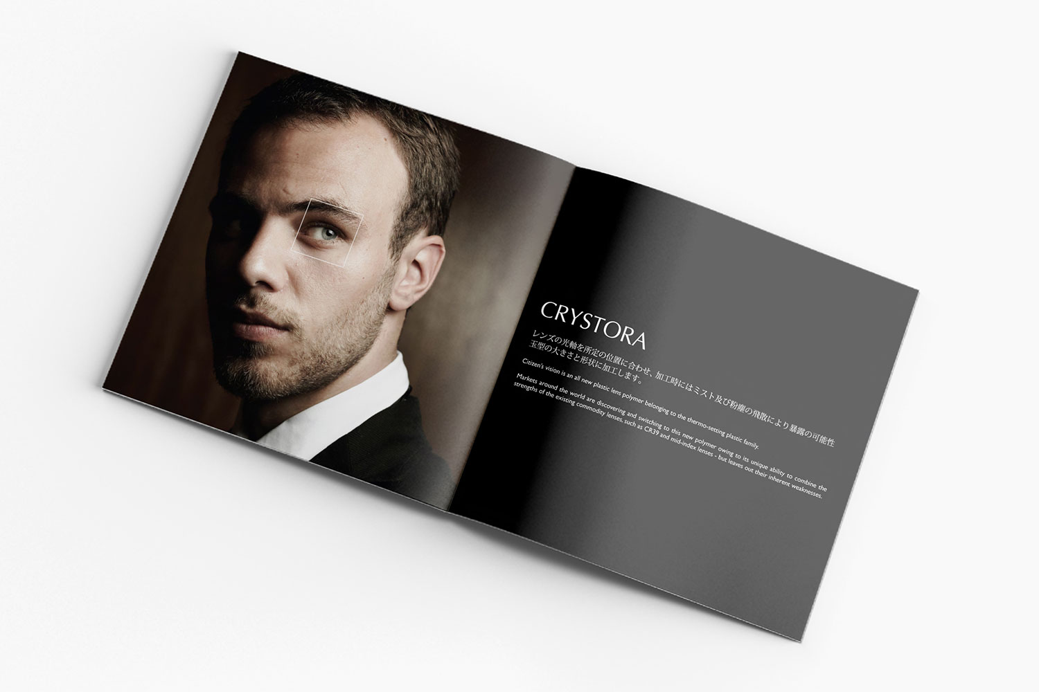 Brochures (Corporate/Product) – A small book or magazine containing pictures and information about a product or service. Usually come in all sorts of sizes, orientation, and pages. There isn’t any fix rule in designing a brochure but is advisable to keep it clean and less clutter. Some prefer it to be loud with vivid color and some like it clean and simple. Either way, the brochures must be visual appealing in the rules of graphic design. Images play an extremely important role when it comes to designing a brochure. Crappy images will never look good even if the layout is perfectly crafted. Some of our clients told us that they actually do not mind those crappy images BUT little did they know that it DOES MIND.
Software knowledge : Illustrator (10%) + Indesign (70%) + Photoshop (20%)
Brochures design : Sun Collection Square Brochures | A5 Landscape Corporate Brochures | Z-fold Brochures |
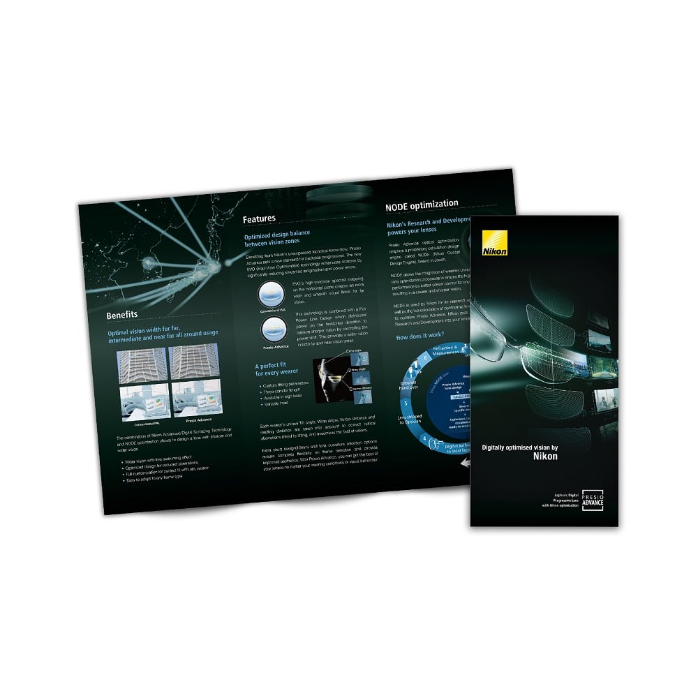
Brochures (DL/Product/Promotion) – One eternal dispute that continues to take place forever in graphic design is the differences of a booklet brochure from folded brochure. The most unfortunate fact is that the term ‘brochures’ is being used interchangeably, making the situation even more confusing. Usually, we will first determine the number of pages and amount of contents required, before categorising it. Product brochures or promotion brochures can be of any size. The common one is DL brochure, a third of the size of an A4 paper. The term “DL brochures / Product brochures / Promotion brochures” used in this category usually is for short term, new services introduction or products to promote the business. Again, there is no fix rule in designing the mentioned brochure. The tricky part is either too much or too little content for this case.
Some Tips for designers #1. Get the amount of content right as close as possible from your clients. #2. Choose a readable font size (8 or 9 base on Helvetica) and paste the content into the paper size you are about to design. #3. Segment the content space – if 1/4 page used on text, make images as the main priority. If 1/2 page used on text, make segmentation as a priority. If 3/4 page use on text, then make text as the main priority and reduce the fonts size by 0.5 or 1 point on the final layout. Golden rule in graphic design : Never increase the fonts sizes to fill up space!!!!
Software knowledge : Illustrator (85%) + Photoshop (15%)
Brochures design : DL Promotion Booklet Brochures | A5 Product Brochures | 2-folded DL Brochures | A4 Product Brochures |
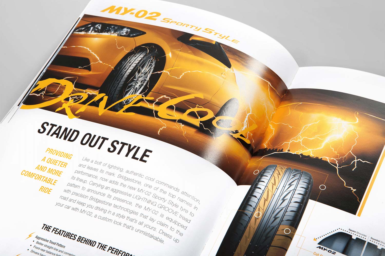 Catalogue – Usually a printed booklet with a list of goods or products with description published. Currently, online e-catalogue is getting more popular due to saving high printing cost. Catalogue design is somehow similar with brochures – usually varies in size, orientation, and page. Due to the page limitation, it is not easy to find a beautiful donel product catalogue. The more pages required, the higher the cost is in both design and print aspect. Therefore, many customers will fully utilise the limited pages by inserting as many products as possible and ended up cluttering the while layout. In order to design the catalogue to be less cluttered and for better aesthetic appeal, apply this 4 rules – #1. Consider changing the size of the booklet if it doesn’t fit. #2. Carefully segment out the products. #3. Select one or two core products in every segment. #4. Choose fonts with lots of different variation within its family. If all the 4 rules do not help, apply the 5th rules and it will solve your problem. Look at some of our success story on catalogue designs.
Software knowledge : Illustrator (5%) + Indesign (85%) + Photoshop (10%)
Catalogue design : Bridgestone Pattern Digest (142 pages) | Durasafe Product Catalogue (862 pages) |
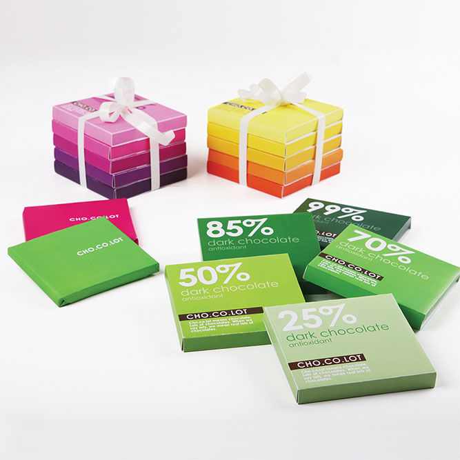 Packaging – The function focuses on 3 aspects – Carrying, Protecting, and Presenting a product. Not every graphic design agency has the opportunity to work on packaging design due to little market demand and there is only a handful of good packaging designers. Packaging design is complicated. Here’s the 4 basic principles of packaging design. #1 Feature on your product strength. How is it different from your competitor. #2 Visual and content of the packaging must be appealing to bring out the value of the product and brand message to the user. #3 Assume your customers know nothing about your products. Therefore, content must be rich and subtle. #4 Make structure frustrate-free and practical. Be sure the finished product is Easy-to-open, display and transport. This is the only aspect on “Presenting”!! I could say packaging design is the most interesting work in graphic design.
Software knowledge : Illustrator (90%) + Photoshop (10%)
Packaging design : CHO.CO.LOT | NIKON LENS WIPE | NIKON i-CAPTURE |
 Poster / Banner -A piece of digital or printed paper that include both textual and graphic elements, designed to be both eye-catching and informative. Its main purpose is to convey information and message with immediacy and purpose. They are a part of marketing tool in a campaign. The most common 2 types of poster are “Brand Awareness” and “Promote-an-Action”. An effective “Promote-an-Action” poster design must grab your attention even from a distance and entice you to read the information. The information must be completely presented clearly when being seen by the consumers. Lastly, it needs to convey the overall message to consumers and turn into action. #Rule – Visually Impactful with Strong Punch Line!
Brand Awareness poster is usually visually impactful and provide less detailed information. The purpose is to spread the word about your brand, getting your message out there and making visual elements more recognisable. The objective is to reach out to consumers, build trust and royalty in order to turn them into potential customers . #Rule –KISS , Keep It Simple Stupid.
Software knowledge : Illustrator (80%) + Photoshop (20%)
Poster (Brand Awareness) : CRIZAL | BBGR | TOSHIBA |
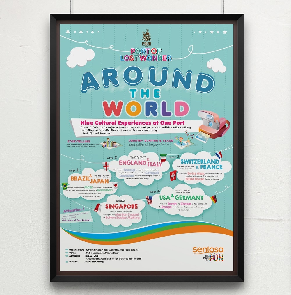
Poster (Promotional) : BOC Movies Promo | BOC Credit Card | POLW Theme Park | CONUTINK Ice cream |
You may interest to know more on :
Branding, Advertising, Web Design, Apps, Photography and Videography.
PRIVACY POLICY :-
This blog does not share personal information with third parties nor do we store any information about your visit to this blog other than to analyze and optimize your content and reading experience through the use of cookies. You can turn off the use of cookies at anytime by changing your specific browser settings. We are not responsible for republished content from this blog on other blogs or websites without our permission. This PRIVACY POLICY is subject to change without notice and was last updated on August 2016. If you have any questions feel free to contact us directly at: Privacy Policy matters
CREDIT + DISCLOSURE :-
All images posted on this blog are either taken by IDEAS PEOPLE PTE LTD, or otherwise credited with the source. Feel free to share images from our website or blog for non-commercial use, but please do credit Ideas People Pte Ltd, and other sources, appropriately. All information provided in this blog are original written by us, or otherwise credited with the original source. This CREDIT + DISCLOSURE are subject to change without notice and was last updated on August 2016. If you have any questions feel free to contact us directly at: Credit + Disclosure matters
CONTACT US (Blog) :-
Want to collaborate? We are interested! Kindly drop us an email to: Calvin, editor of Ideas People. Or you can give us a call at our main line +65 68487030.
Cal
Nice!!
92Bess
Hello admin ! I read your articles everyday and i must say you
have high quality content here. Your website deserves to go viral.
91Demi
Hello admin ! I read your posts everyday and i must say you have high quality content here.
Your website deserves to go viral.
Rvacadelhi
I really appreciate your professional approach. These are pieces of very useful information that will be of great use for me in future.
lensico
very informative post for me as I am always looking for new content that can help me and my knowledge grow better.
buy pbn
I have read so many articles or reviews about the blogger lovers but this post is truly a fastidious post,
keep it up.
loup
Thanks for sharing your thoughts on agreement.
Regards